After an inaugural season in which PWHL New York made a lot of noise, playing with the in-your-face energy and full-volume style of the City it represents, the team is turning its high-decibel hockey up a notch as the New York Sirens.
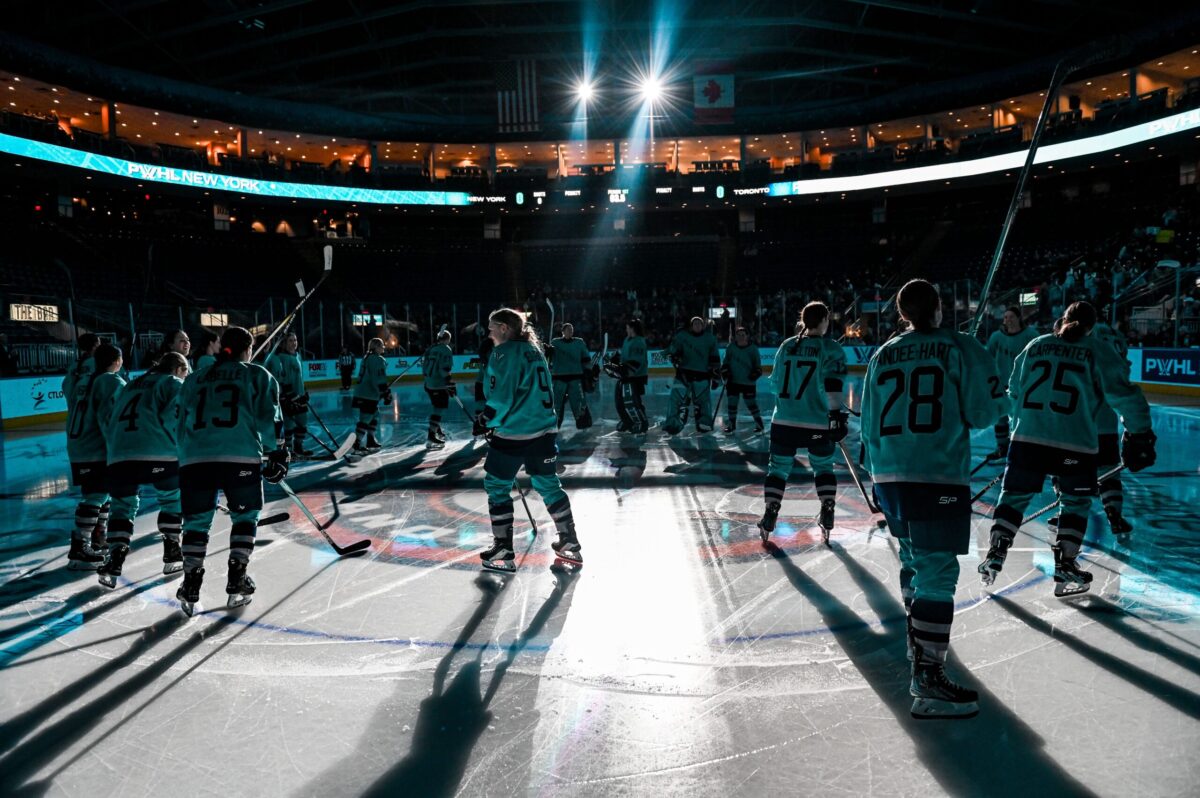
In New York, you gotta get loud to get heard. The pace is fast, the energy high, and the decibel level higher still. Keep up or keep moving. In January, PWHL New York, whose in-your-face attitude echoed the City’s, captured the imagination of tri-state hockey fans who liked what they heard and saw: a team that doesn’t back down and won’t ever go quietly. After being eliminated from playoffs, PWHL New York finished their season relishing the role of spoiler, playing their best hockey until the final horn. Looking toward their second season, they are a team poised to make some noise—they have a new head coach who’s a proven winner, a smooth-passing stopper in Ella Shelton, a finalist for PWHL best defensive player, and an absolute scoring machine in center Alex Carpenter, who was named one of three finalists for the league’s Billie Jean King MVP trophy. Carpenter will be looking for more after leading the team in points—assisting on 15 goals and finding the net eight times herself. Each New York score unleashed an exhilarating sound—the flashing goal siren’s blaring horn—followed by an even louder roar from the home crowd.
Now, PWHL New York has a fitting new nickname that embodies the soul of the city and its brand of full-volume hockey. Listen up: The New York Sirens are here.
Earlier today, at Good Morning America’s studios in bustling Times Square, Amy Scheer, the PWHL’s Senior Vice President of Business Operations, introduced the team’s proud-to-be-loud name and visual identity. “It’s about that attitude ‘I’m a New Yorker, you’ll always hear me coming,’” Scheer says of the name. “And now it’s “We’re the Sirens, you’ll always hear us coming.’”
The name captures not only the sonic symphony playing on repeat in New York but also what powers it. “It’s about the energy of the City. There’s this vitality to it. It just makes you feel alive,” says Hockey Hall Fame inductee Jayna Hafford, the PHWL’s Senior Vice President of Hockey Operations. “The pace, the intensity of New York and people who live here—it’s dialed up non-stop.”

That connection was the most crucial element of the name. “The heart of our effort was to capture the soul of New York and its people,” says Kanan Bhatt-Shah, the league’s VP of Brand and Marketing. “New York’s name had to bottle up the essence of what makes this city the force that it is and speak to New Yorkers in a powerful, authentic way – both verbally and visually.”
The league also needed the name to be distinctive, easily grasped, enduring, and built to last—and they needed it fast. To be ready for the start of the second season (inclusive of jerseys reflecting the new team identities), as fans requested, the PWHL had less than a year to develop names and identities for its six teams—more than a New York minute but less than half the time sports teams typically devote to creating a single identity. The league partnered with Flower Shop, the Lower East Side-based creative agency recently named Newcomer Small Agency of the Year by Ad Age, collaborating on the identity development process. “We had a deadline, but we took the time, care, and craft to get this right,” says Alastair Merry, the agency’s co-founder and Chief Creative Officer. There was extra pressure to get the New York team identity right, Merry adds. “This is where we live—we had to do our best work to represent New York.”
Wasting no time, the team immersed themselves in fan and player interviews, watched games, live and recorded, to understand the New York squad and its supporters, and analyzed team names of teams in every sport, of every size, every level of competition. Almost as soon as possible names were amassed, the arduous intellectual property process began, with some possible names succumbing to legal red flags and copyright conflicts. In the end, the Sirens cut through the noise.

From there, the challenge was visual. A great name isn’t a great team identity unless it can bring the thunder graphically—stitched on jerseys, hats, and tees; printed on subway posters, billboards, and the sides of buses, and animated on smartphones, scoreboards, and every screen in between. Designing a static siren graphic was straightforward enough, but showing it was another thing altogether. “Visualizing sound is a pretty abstract concept,” says Merry, who oversaw the design process. The City inspired the solution. “We started thinking about the ambient noise in New York—it’s like a sub-woofer is playing everywhere. That led us to picture how sound can make a car or a sports arena vibrate.”
The designers then turned idea into image, bookending the siren radiating patterns representing reverberating sound waves that make the logo look loud and in motion, like New York itself. Behind that is an angular ‘NY’ drawn to evoke the City’s iconic architecture.
![]()
The color palette, too, is packed with meaning: The Sirens’ primary color, a bright shade of teal, evokes the copper of the Statue of Liberty and links the Sirens to New York’s other women’s sports teams. The accents are twists on the City of New York colors: a dark, almost midnight blue, and a bold orange that nods to the vibrant hues of taxis and construction zones that are ever-present on New York streets. The sans serif typography was chosen for traits that are pure New York—height and density and bold vertical characters packed with power and purpose.
The overall effect is to evoke urgent, in-your-face energy and exhilarating sights and sounds that inspired the team’s name. “I love that the logo represents the market so well,” says Scheer. “You have the big blocky letters reflecting big buildings, and then you’ve got the sound patterns that are in motion. You can’t be quiet or stand still here in New York, right? It’s fun, it’s colorful, and yes, it’s loud.”
“They’ve got a lot of skill, they’re physical, they’ve got some characters,” Hefford says, describing the New York squad. “When they pull it all together, I think they’re going to be a dangerous team and a fun team to watch.” Fans already picked up on that. In a crowded market with 18 other professional sports teams, the PWHL New York forced their way into the conversation and turned up their game and their volume to make themselves heard, achieving the highest attendance in their last game of the season. That buzz is only going to get louder with a new team name that’s a shout-out to the most exciting City in the world—and the most exciting sound on ice.
But, in true New York fashion, the team’s ambition and drive is a force to be reckoned with, and they aren’t content with stopping there. “In a city where excellence is the standard, being heard isn’t enough. The Sirens aim to lead the way,” says Pascal Daoust, the team’s General Manager. “We’re not just here to make noise; we’re here to make a difference, embodying the spirit of New York—bold, unique, loud and relentless in our pursuit of greatness. We don’t just want to be heard; we want to be remembered.”
So yell it from the rooftops: Full volume hockey is here. The Sirens are on.